












Listen to this story · 6 min
A collector in Tennessee wrote to us last year. He had inherited thirteen framed Glen Loates works after his mother died. She had bought them in the late 1970s and they had hung in the family home ever since.
Fifty years on, the black and white pieces were holding up extremely well. Several of the colour ones had yellowed and shifted, and he had worked out for himself why: they had spent decades on walls that took direct sun. He was replacing the worst of them, and he wanted us to know the collection would be passed to his children.
He is not the only one. Another customer replaced a Goldfinch her mother had hung in a very sunny room for decades. A third was given a piece by a neighbour that had faded badly by the time it reached her.
Three people, independently, describing the same thing. It deserves a proper answer rather than a reassurance.
What was actually happening in the 1970s and 80s
The works those customers own were produced by my parents. My father and my mother, Sara, ran the business as Premier Art Editions, and the work was made by the only method available at the time: colour separations.
The original painting was photographed and split into separate colour plates. Each plate was etched with a fine screen of dots, and the image was rebuilt on press, one colour at a time, dot over dot. Look at one of those works under a magnifying glass and you will see it: a rosette of tiny coloured dots that your eye blends into continuous tone from a normal viewing distance.
The printing itself was done by an outside company, and my father did not simply hand the paintings over and wait. He went to the printers himself and stood at the press, checking the separations against the original and correcting the colour until it was right.
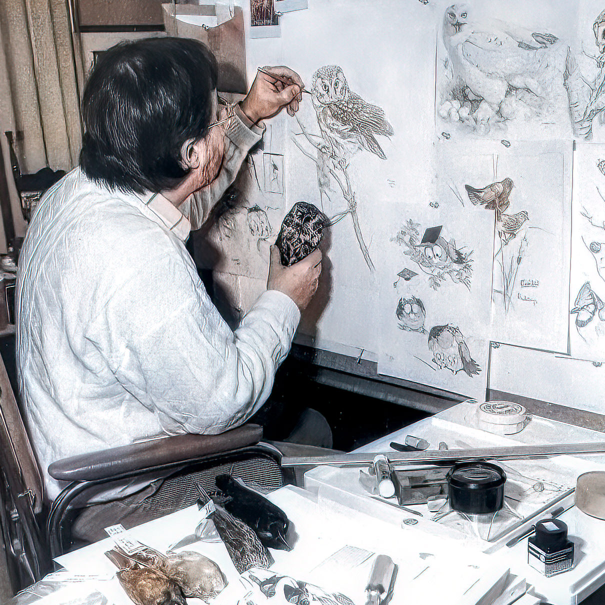
There is a photograph of him doing it. He is bent close to a full press sheet of the Common Loon, examining the bird's head at a distance of a few inches, with the printer's colour control strip running along the top edge of the sheet. It is the same posture as the studio photographs: face close to the work, checking.
So this is not a story about corners being cut. The colour on those pieces was signed off by the man who painted them.
What he could not correct was the chemistry. The inks were not designed for fifty years in a south-facing window. Ultraviolet light breaks down pigment, some colours far faster than others, and the damage accumulates quietly. That is why a black and white drawing from the same year can look untouched while the colour piece beside it has drifted.
Nobody did anything wrong. The material had a lifespan, and in some homes it reached it.
What changed
The works we produce now are not an improved version of that process. They are a different object.
They are giclée: pigment sprayed directly onto the sheet from high-resolution digital files, using Epson pigment inks, on acid-free paper or canvas.
There is no screen. No plates, no dots, no rosette. Where a separation builds green out of a lattice of yellow and blue dots, a giclée lays down green. Under magnification you see continuous pigment rather than a pattern.
Two things follow from that. The colour is more faithful, because a separation is an interpretation of a painting filtered through the limits of four plates, while a giclée is a direct reading of the original. And the pigment is far more stable. Pigment inks on acid-free stock resist ultraviolet light to a degree that 1970s process inks simply could not. This is the single biggest material change between the two eras.
How to tell which one you own
Get a magnifying glass and look closely at an area of flat colour.
Dots in a regular rosette pattern: a separation, almost certainly from the 1970s, 80s or 90s.
Continuous, unbroken colour: a giclée, produced in the current era.
That is the whole test, and you do not need us to perform it. It is one of the few questions in the art world that a collector can settle for themselves in about fifteen seconds.
What to do if yours has faded
Do not throw it away. A faded piece from 1978 is still the object your mother chose and hung, and it carries a history that a new one cannot. Several of our customers keep the original and hang a new one elsewhere.
Move whatever you keep out of the light. This applies to both kinds. Pigment inks are far more durable, not immortal, and no work of art on paper belongs on a wall that takes direct sun.
If you are replacing something, tell us what it is. We hold the archive, and matching a specific piece from the 1970s to what is available today is exactly the kind of thing we can help with.
Why we are telling you this
We could have left it. Nobody was complaining. The customers who wrote about fading were, without exception, generous about it.
But my father took a public position on this decades ago. Faced with a market where buyers could not tell an original from a limited edition from a decorator reproduction, he wrote out the differences plainly and said that the answer to the confusion was to educate the buyer, and that this was why he had spoken out.
The gallery is a continuation of that. If you are going to buy something intended to hang in a family home for fifty years, you should know exactly what you are buying, how it was made, and what it will and will not survive.
That includes telling you which of our own products were not built to last forever.
Michael Loates, Owner
Glen Loates R.C.A., Artist


Leave a comment (all fields required)